
Widgets display data on a page and allow users to interact with it.
Understanding widgets #
A page on its own is empty. Everything a user reads, selects, types, or triggers is a widget placed on that page.
Widgets fall into three groups:
- Data widgets show and edit objects from a dataset. These are the Table widget, the Text Grid widget, and the Form widget.
- Content widgets display text and layout. These are the Text widget, the Card widget, and the Divider widget.
- Action widgets perform a navigation or an action. This is the Button widget.
Widgets are added and arranged in layout edit mode, and used in the normal view. A widget can also appear on more than one page as a linked widget, so that one configuration serves several pages.
Add a widget to a page #
To add a widget:
- Open the relevant application page.
- Enable Layout edit mode.
- Select Add a widget in the toolbar at the top of the page.
- Choose the widget type.
- Configure the widget settings.
- Connect it to the relevant data or action, where required.
- Select Create.
- Save the page layout.
The exact settings depend on the selected widget type.
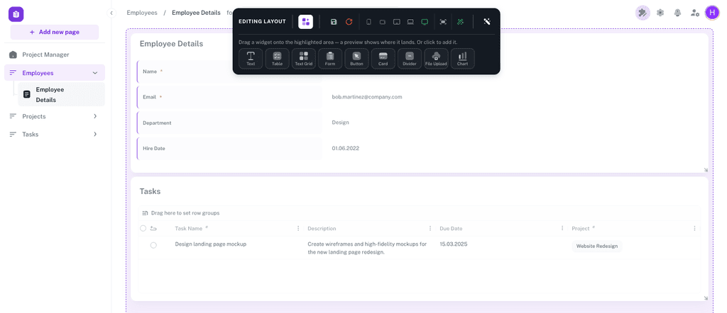
You can add a widget by selecting it or by dragging it onto the page. A preview shows where the widget will be placed.
Move and resize widgets #
Widgets sit on a grid. Drag a widget anywhere on its body to move it, and drag its bottom-right corner to resize it; that corner is the only resize handle. Other widgets move out of the way and rise to fill any gap left above them.
The grid has a different number of columns at each screen size, so that a layout built on a laptop still works on a phone:
- Extra Large, wider than 1536 pixels — 12 columns
- Large, 1200 to 1536 pixels — 10 columns
- Desktop, 900 to 1200 pixels — 8 columns
- Tablet, 600 to 900 pixels — 4 columns
- Mobile, narrower than 600 pixels — 2 columns
Each screen size keeps its own arrangement. Use the breakpoint buttons in the edit toolbar to preview a size and adjust the layout for it. Auto-detect screen size returns the preview to the size you are actually working at. When the previewed size is wider than your own screen, a further button switches between Fit preview to screen and Show actual size (1:1); it stays disabled while the preview already fits.
The toolbar also has a save icon and a reset icon. Layout changes are not stored until you save them. Leaving layout edit mode with unsaved changes prompts you to Discard Changes or Save Changes.
Configure a widget #
To change an existing widget:
- Enable Layout edit mode.
- Select the three-dot menu on the widget.
- Select Edit widget.
- Change the settings.
- Select Update.
Every widget except the Divider widget has a Widget Title and a description field, each with an eye icon that controls whether it is shown. A widget can therefore have a title used for identification while building, and no visible title for users. The description field is labelled Description.
Configuration for the Table, Text Grid, and Form widgets is arranged as a series of steps. Move through them in order the first time; afterwards you can jump straight to the step you need.
Connect a widget to a dataset #
Widgets usually need to be connected to a dataset before they can display or manage data. How that connection is made depends on the widget.
A Table widget is connected on its Data Source step. Choose the connection and then the dataset. Each column is then mapped to a property of that dataset.
A Text Grid widget and a Form widget are connected item by item. Each item names an Object, which is one of the page’s parameters, and a Property of the dataset that parameter is bound to. This is why these two widgets belong on details pages, where a parameter identifies the object.
A Text widget, Card widget, and Button widget are connected indirectly. Write $(parameterName) inside a text or address field, and Auclio replaces it with the value from the page’s parameter when the page is opened.
A Divider widget displays no data and is never connected.
See Understanding datasets for detailed instructions on datasets and properties, and Pages for detailed instructions on parameters.
Copy and reuse a widget #
Auclio has two ways to reuse a widget.
Copy widget makes an independent copy on the page you choose. Changing the copy does not change the original. Use this when you want a similar widget that will evolve separately.
Create linked widget places the same widget on another page. There is one configuration, shown in several places, so a change made anywhere changes all of them. Use this for something that must stay identical, such as a standard header block.
To copy or link a widget:
- Enable Layout edit mode.
- Select the three-dot menu on the widget.
- Select Copy widget or Create linked widget.
- Choose the Target Page.
- Choose the location on the page: Header, Main, or Footer.
- Select Copy, or Create for a linked widget.
A Table widget and a Text Grid widget can only be placed in Main; the other two choices are disabled for them. Header and Footer are also disabled when the target page does not have that area switched on.
Move widget relocates the widget instead of copying it, using the same target choices and confirmed with Move. View linked widgets lists every page a linked widget appears on, and shows the count beside the menu item.
Delete a widget #
To delete a widget:
- Enable Layout edit mode.
- Select the three-dot menu on the widget.
- Select Delete widget.
- Confirm the deletion.
Deleting a linked widget deletes every instance of it. On a linked widget the menu item reads Delete all linked widgets instead, and Auclio tells you how many instances are affected before you confirm. To remove one instance and keep the rest, select Delete this widget, which appears only while the widget is used on more than one page.
Deleting a widget does not delete the dataset behind it or any objects in that dataset.
Test widgets in User mode #
Layout edit mode shows you the page as a builder. Users see something different: no edit toolbar, no hidden pages, and only the data their permissions allow.
To test a widget:
- Disable Layout edit mode.
- Open the page.
- Check that the widget shows the expected data.
- Perform the actions the widget is meant to support, such as adding a row or submitting a form.
- Resize the browser window to check the layout at a narrower width.
- Repeat the checks with an account that is not an administrator (administrators bypass permission checks, so a widget can work perfectly for you and show nothing to everyone else).
Widget types #
Auclio offers seven widget types. Each has its own page describing every configuration option in detail.
| Widget | Use it to | Reads a dataset |
|---|---|---|
| Text widget | Show headings, instructions, and explanatory text, with Markdown and page parameters | No, but it can display parameter values |
| Table widget | Show many objects as a list users can search, filter, sort, group, create, edit, and delete | Yes, directly |
| Text Grid widget | Show one object’s values in a structured grid, typically on a details page | Yes, through a page parameter |
| Form widget | Let users create or edit an object by filling in fields | Yes, through a page parameter |
| Button widget | Send users to another page or an external address, optionally only when a condition holds | No |
| Card widget | Highlight a single value or message, such as a count or a status | No, but it can display parameter values |
| Divider widget | Separate sections of a page, or reserve deliberate empty space | No |
| Chart widget | Summarise a dataset as a bar, line, area, pie, or doughnut chart, grouped by one of its properties | Yes, as totals rather than as rows |
| Upload widget | Let users drop many files at once and create the objects that hold them | Yes, it creates objects in one |
Two distinctions are worth knowing before you choose.
A Table widget shows many objects; a Text Grid widget shows one. That single difference decides which belongs on a page. Lists get tables, details pages get text grids.
The Form widget is the Text Grid widget in form mode. It has its own tile in the palette and an extra configuration step for its submit button, but it is stored as a Text Grid and shares that widget’s items, layout, and file settings.
Each page linked in the table above documents every configuration option for that widget type.
Computed values #
Wherever a widget accepts a parameter — the text of a Text widget, a Card’s main or header text, a Button’s label, a Table column’s default value or condition — it also accepts a computed value: a number calculated from a dataset at the moment the widget is drawn. A card can read Count of Accounts without a dataset behind it and without anyone maintaining the figure.
To add one:
- Select Insert parameter on the field.
- Open the Aggregations section and select New aggregation.
- Choose a Dataset.
- Choose a Function — Count, Sum, Average, Min, or Max.
- For everything except Count, choose a Field. Only Integer and Decimal properties are offered; where the dataset has none, Auclio says This dataset has no Integer/Decimal properties to aggregate.
- Select it to insert it into the field.
The computed value appears in the field as a named chip such as Count of Accounts, and the field’s preview line shows what the widget will read. You can rename a chip, which changes only its label.
A computed value belongs to the widget it was created on, not to the application, so it is reusable across every field on that widget and nowhere else. Delete aggregation removes the definition; it does not remove chips already placed in other fields on the widget, which then read as an unknown aggregation until you remove them too.
The Chart widget uses the same calculations as its series, configured on the chart itself rather than through this picker.
Widget recommendations #
When adding widgets to a page:
- use a Table widget for lists and a Text Grid widget for one object;
- give every widget a title, and hide it only when the page already makes the content obvious;
- enable editing and deletion only where users genuinely need them;
- check the layout at a narrow width before releasing the page;
- use a linked widget when something must stay identical across pages, and a copy when it will not;
- keep the number of widgets on one page small enough that the page fits on a screen without long scrolling.
