
Pages organize the application interface and determine how users access information and functionality.
Understanding pages #
An application can contain several pages, each designed for a specific task. For example, a customer management application might include:
- an Accounts page;
- a Contacts page;
- an Account details page etc.
Pages act as containers for widgets. The page itself defines where users navigate, while widgets determine what users see and what actions they can perform.
Pages appear in the navigation on the left, in the order you set. A page can have sub-pages, which appear indented beneath their parent when the parent is selected. One page is the application’s home page and opens when a user enters the application.
Every page also has three separate areas a widget can be placed in: the main area, an optional header, and an optional footer. The main area is always available; the header and footer are switched on per page.
Main pages and details pages #
There are two kinds of page, and the difference is whether the page works with a list or with one object.
A main page shows many objects. An Accounts page with a Table widget listing every account is a main page. It does not need to know which account you are interested in, because it shows all of them.
A details page shows one object. An Account details page showing one company’s information, its contacts, and its files is a details page. It cannot work until it is told which account to display.
Pages are told which object to display through parameters. A parameter is a named slot on the page, bound to a dataset. When a user opens the page from a linked table column or text grid item, the object identifier travels with them and fills the slot. Widgets on the page then read their values from that object.
How to build a details page #
To build a details page:
- Create the page as usual.
- Add a parameter and give it a clear name, such as
account. - Bind the parameter to the dataset the page describes.
- Add widgets and point their items at that parameter.
- Link to the page from a table column or a text grid item, passing the object.
When creating a details page, make sure that:
- the correct object is passed to the page;
- the widgets are connected to the relevant parameter;
- users have permission to view the object;
- navigation back to the main page is clear.
Show parameter selector in header appears once the page has at least one parameter, and is switched on by default. While it is on, Auclio shows a dropdown next to the breadcrumbs at the top of the page, so users can move between objects without going back to the list. Switch it off if the page should only ever show the object it was opened with.
Create a page #
Pages are created in layout edit mode, from the navigation on the left. Add new page is available in every navigation layout, although the horizontal layout labels it Add page and the mini layout shows it as an icon only. The per-page hover controls, Add child page and Edit page, are available in the vertical navigation layout only; in the other two layouts Auclio warns you of this and offers to switch you over. To switch yourself, set Layout back to Vertical in your user settings.
To create a page:
- Open the application.
- Enable Layout edit mode.
- Select Add new page above the navigation.
- Enter the page title.
- Choose a page icon.
- Configure the page settings.
- Select Create.
Auclio creates the page, adds it to the navigation, and opens it.
To create a sub-page directly beneath an existing page, hover over that page in the navigation and select Add child page. Auclio fills in the parent for you.
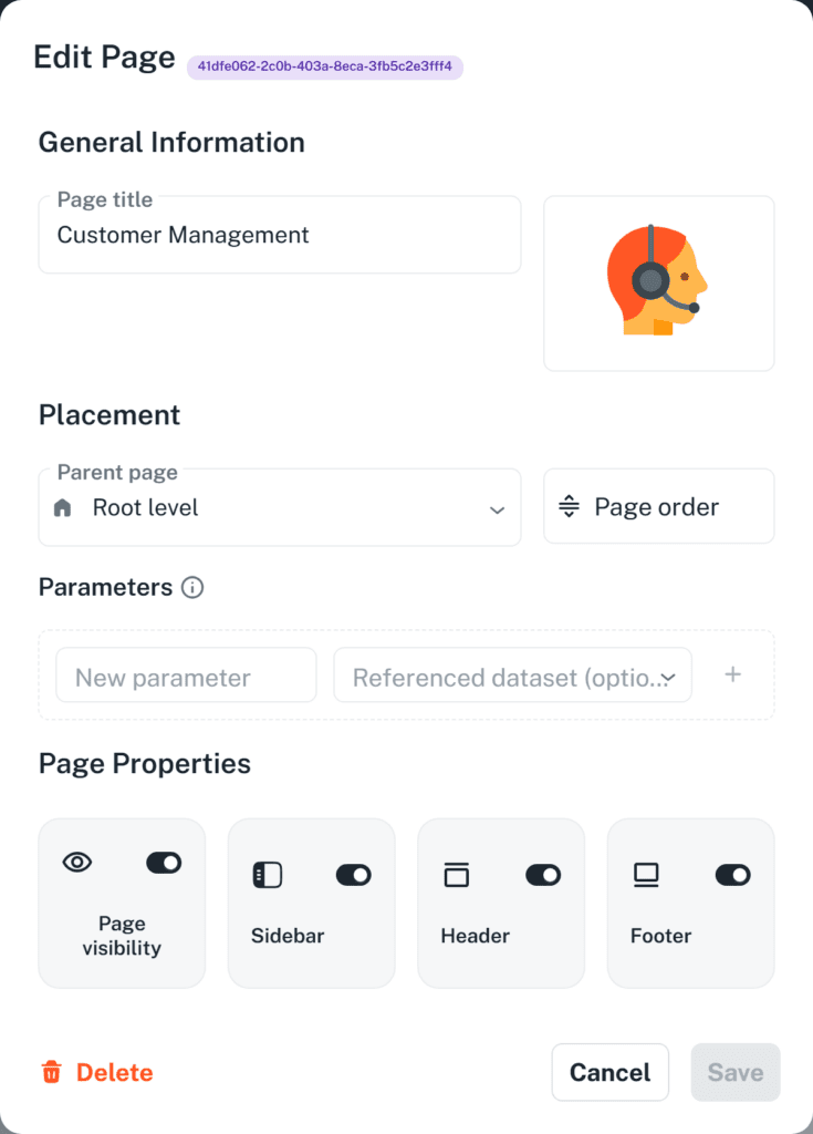
Configure page settings #
The page dialog is divided into four groups.
General Information holds the Page title and the page icon. The title is what users see in the navigation and in the breadcrumbs.
Placement holds Parent page and Page order. Leave Parent page on Root level for a top-level page, or choose a page to nest beneath. Page order opens a dialog where sibling pages can be dragged into the order you want; it is available once there are at least two pages at that level.
Parameters is where details pages are defined, as described above. Parameter names must be unique within a page; the dialog refuses to save a duplicate.
Page Properties holds four toggles:
- Page visibility — whether the page appears in the navigation for regular users;
- Sidebar — whether the navigation is shown while this page is open;
- Header — whether the page has a header area for widgets;
- Footer — whether the page has a footer area for widgets.
The header and footer are switched off by default. Switch one on when you want something to stay in place while the main area scrolls, such as a title block or a row of buttons.
Rename a page #
Renaming is done through the page settings.
To update a page:
- Open the application.
- Enable Layout edit mode.
- Hover over the page you want to change and select Edit page.
- Update the page settings.
- Select Save.
- Review the result.
Renaming a page changes its label in the navigation and breadcrumbs. Links pointing at the page continue to work, because they refer to the page itself rather than to its name.
Reorder pages #
Pages are ordered within their level, so a top-level page can only be reordered against other top-level pages.
To reorder pages:
- Enable Layout edit mode.
- Hover over any page at the level you want to reorder and select Edit page.
- Select Page order.
- Drag the pages into the order you want.
- Select Confirm.
- Select Save.
Add pages to application navigation #
Every page you create is added to the navigation automatically. There is no separate step for publishing a page into the menu.
Where a page appears is controlled by two settings: Parent page decides which level it sits at, and Page order decides its position within that level.
The application’s home page is the page users land on when they open the application. There is no setting that designates it. Auclio picks the page whose address slug is home, which is the page you get by titling it Home, and otherwise the first top-level page in the page order. Page visibility is not considered, so put the page you want users to land on first in the order.
Hide a page from navigation #
Switch Page visibility off to remove a page from the navigation for regular users. Use this for pages that are still being built, and for details pages that should only ever be reached from a table row or a button rather than from the menu.
Administrators continue to see hidden pages while working, marked with an information icon and the note that the page is not visible to users.
Hiding a page is a navigation setting, not a security control. A user who has the page address can still open it unless a permission rule prevents it. Use permissions when the content itself must be restricted.
See Configure permissions for detailed instructions on restricting access to a page.
Link to another page #
Links between pages are configured on widgets rather than on pages. Three widgets can open a page:
- a Button widget, by setting Link type to Page and choosing the target page in Select Page;
- a Table widget, by adding a link to a column so that selecting a value opens a page;
- a Text Grid widget, by adding a link to an item.
Only the Table column and the Text Grid item can map parameters, under Link Parameters. Mapping is what makes a details page work: the row supplies the object, and the target page receives it in the parameter you named.
A Button widget cannot. Its dialog offers a page selector and nothing else, so a button opens the destination without parameters. Use a button for a page that needs no object — a list page, or a page whose form creates one — and link from a table column or a text grid item when the destination has to know which object to show.
Widgets can also link to an external address instead of a page. On a Button widget, set Link type to Url and enter the address; on a Table widget column or a Text Grid widget item, choose External Link.
See Widgets for detailed instructions on configuring links on each widget type.
Delete a page #
To delete a page:
- Enable Layout edit mode.
- Hover over the page and select Edit page.
- Select Delete in the dialog.
- Confirm the deletion.
Deleting a page may also remove access to the widgets and workflows configured on it, so review all links and navigation before confirming the change. Links from other pages that pointed at the deleted page will no longer lead anywhere.
Auclio does not have a duplicate command for pages. To reuse a page’s contents, create the new page and use Copy widget on each widget to place a copy of it there.
Page layout recommendations #
When designing pages:
- give each page one clear job, and name it after that job;
- keep the top level of the navigation short, and use sub-pages for detail;
- use a main page for lists and a details page for a single object;
- name parameters after what they hold, such as
accountrather thanid; - hide details pages from the navigation and reach them from links;
- switch on the header or footer only when something genuinely needs to stay in place;
- check every page with a non-administrator account before releasing it.
